Apollo
A full brand identity system for Apollo, a Science-Fiction Fantasy Library of the 21st Century located in San Francisco, CA. The work covers the complete brand architecture: research and mind mapping, combination marks, color system, typography, program logos, iconography, a campaign poster series, and a speculative wayfinding system.
Project Overview & Concept
Apollo's mission: to foster a community where children and adults are encouraged to dream, create, learn, and collaborate.
The brand needed to communicate wonder, curiosity, and the joy of discovery through a visual system sophisticated enough to function across every library touchpoint. The project was developed as part of a branding design course in the MFA Communication Design program at Pratt Institute.
Knowledge + Science + Fantasy = Apollo
Research & Mind Map
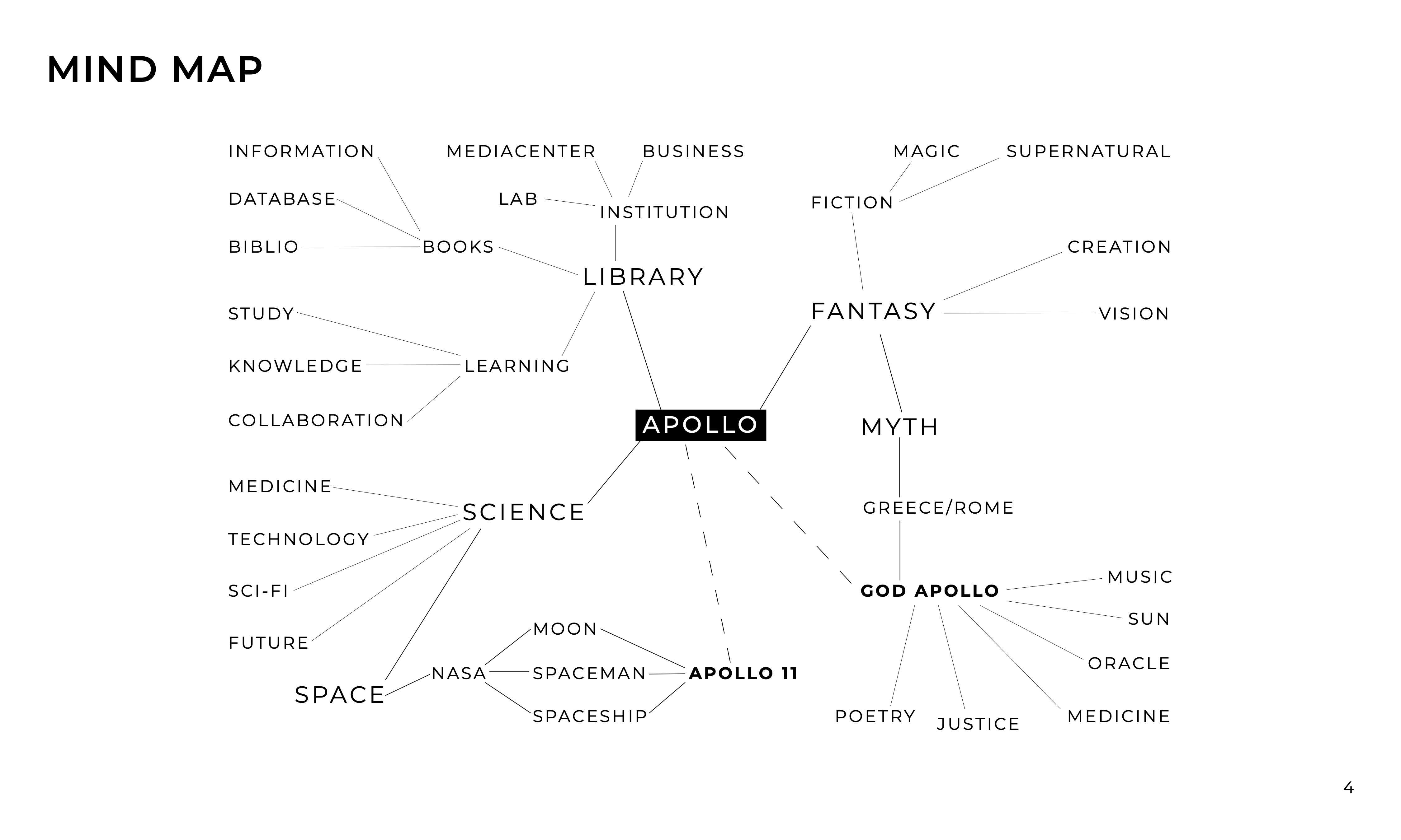
Apollo's core identity pulls in five different directions: Library, Science, Space, Fantasy, and the Greek god for which the library is named. Each branch opened into its own constellation of associations, and together they shaped the conceptual foundation before any visual decisions were made.
Color System
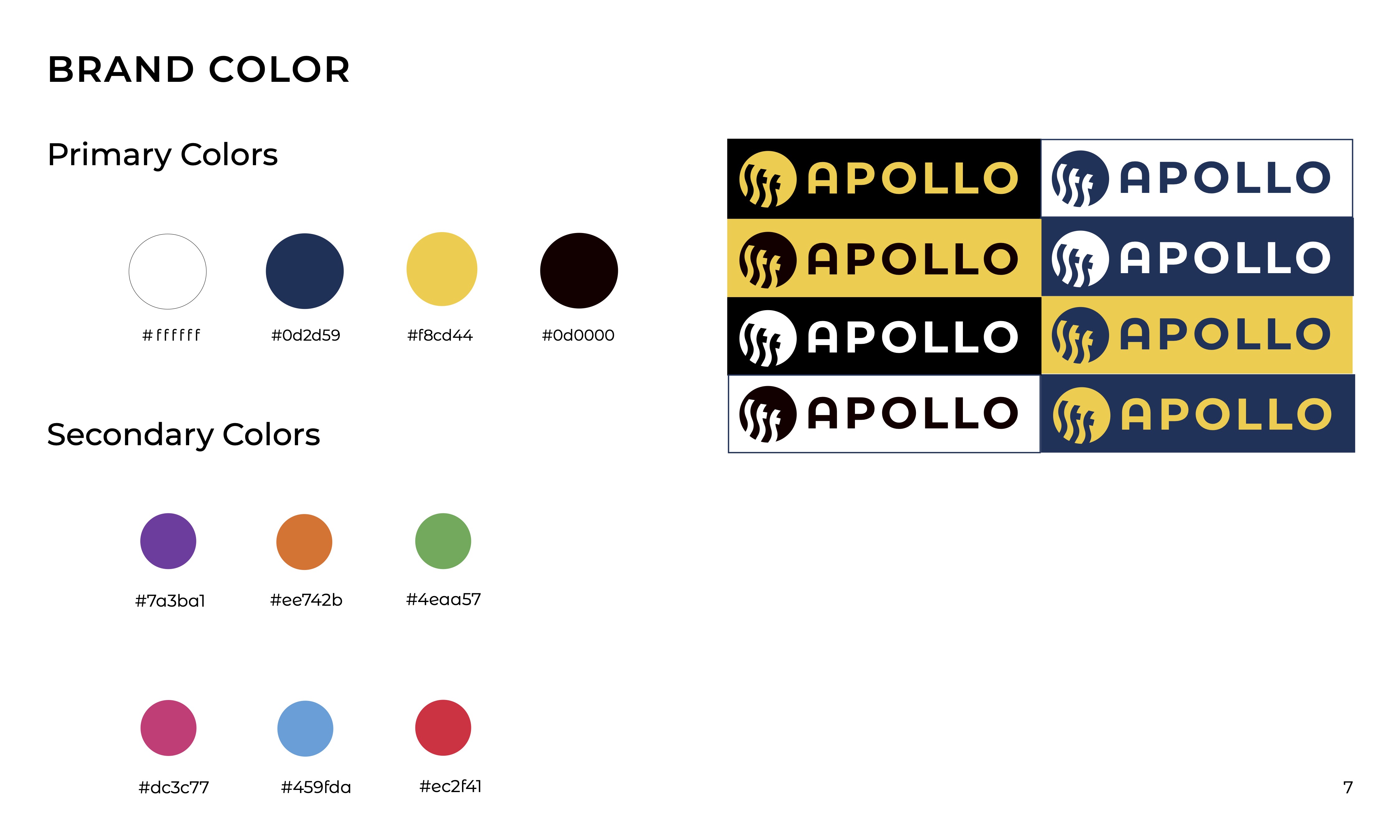
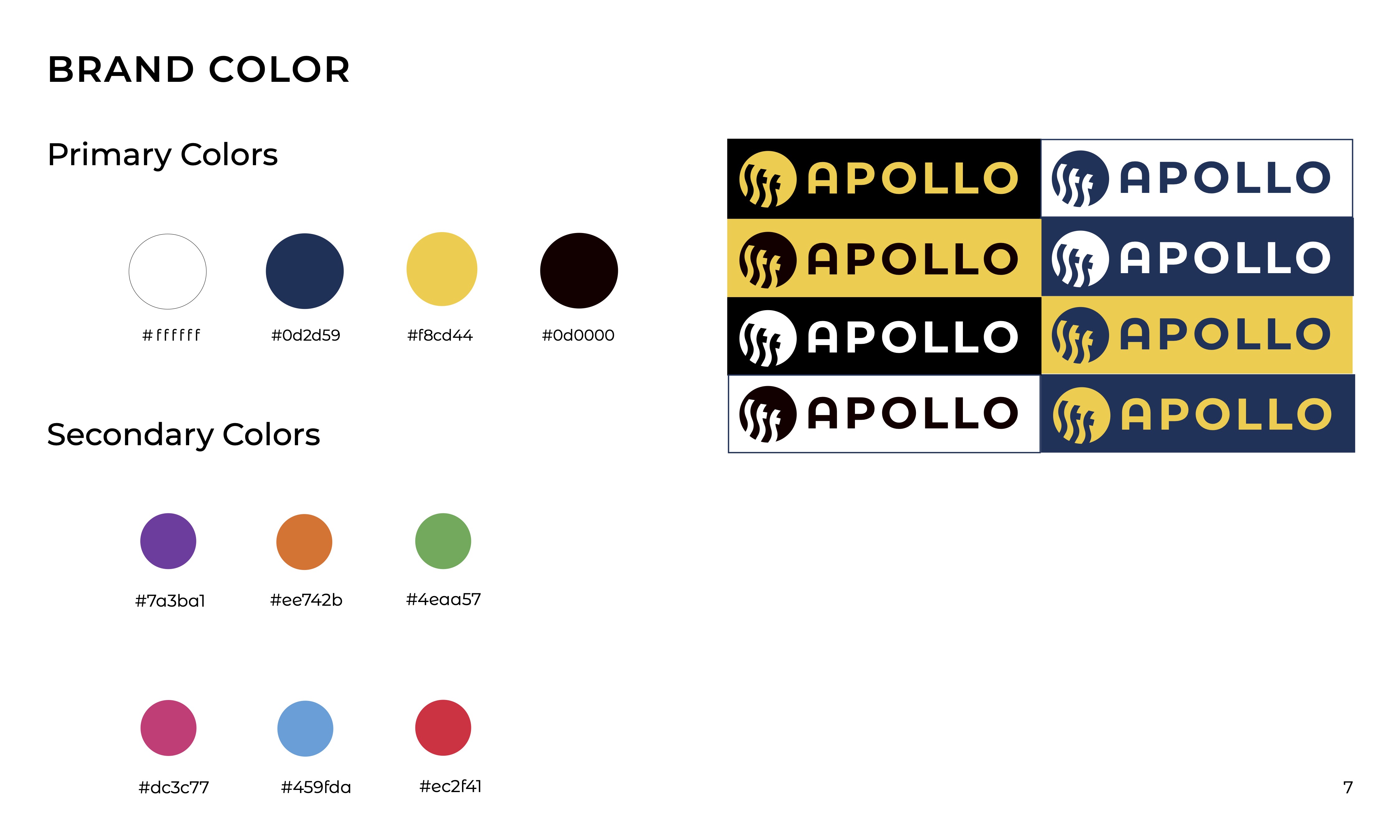
Bold, optimistic, and built to hold two things at once: the serious science behind the library and the joyful energy it aims to inspire. The palette works across digital and large-format print.
Typography
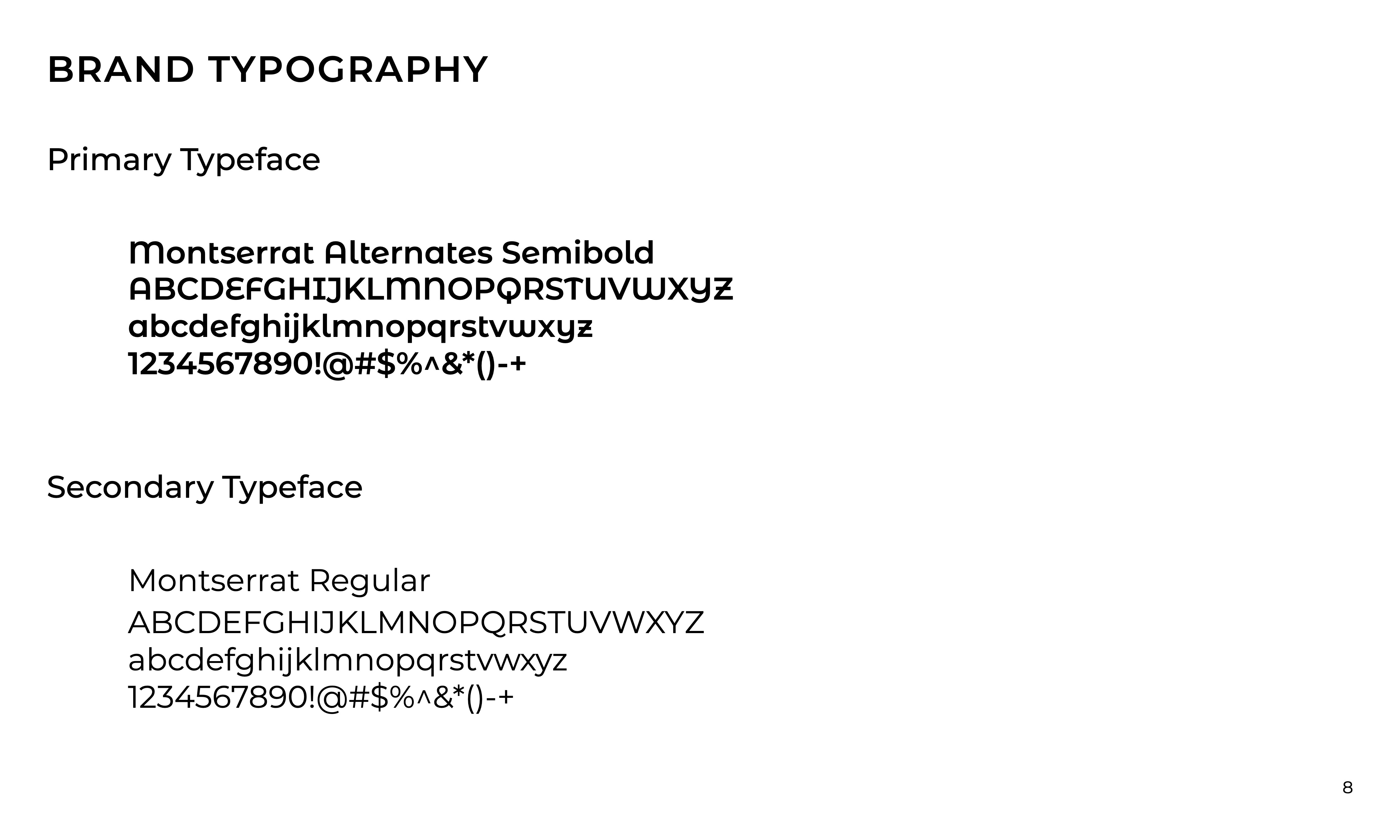
A bold geometric display face for headlines. An approachable humanist sans-serif for body copy and exhibit labels. The two work together across every scale, from large wayfinding totems to small room identifiers.
Icon System
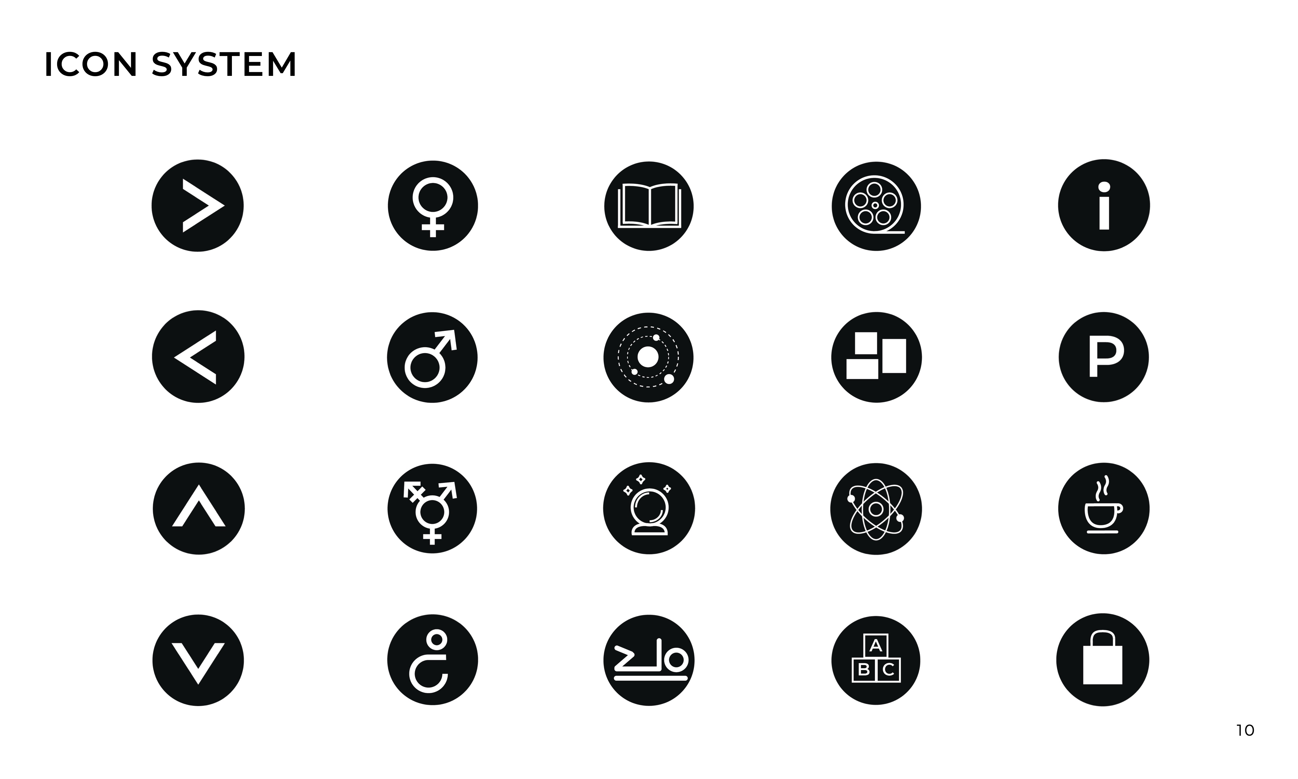
A custom icon set covers the library's navigation and programming categories: astronomy, chemistry, biology, physics, and beyond. Every icon is drawn on a consistent grid, calibrated to read clearly at wayfinding scale.
Combination Mark
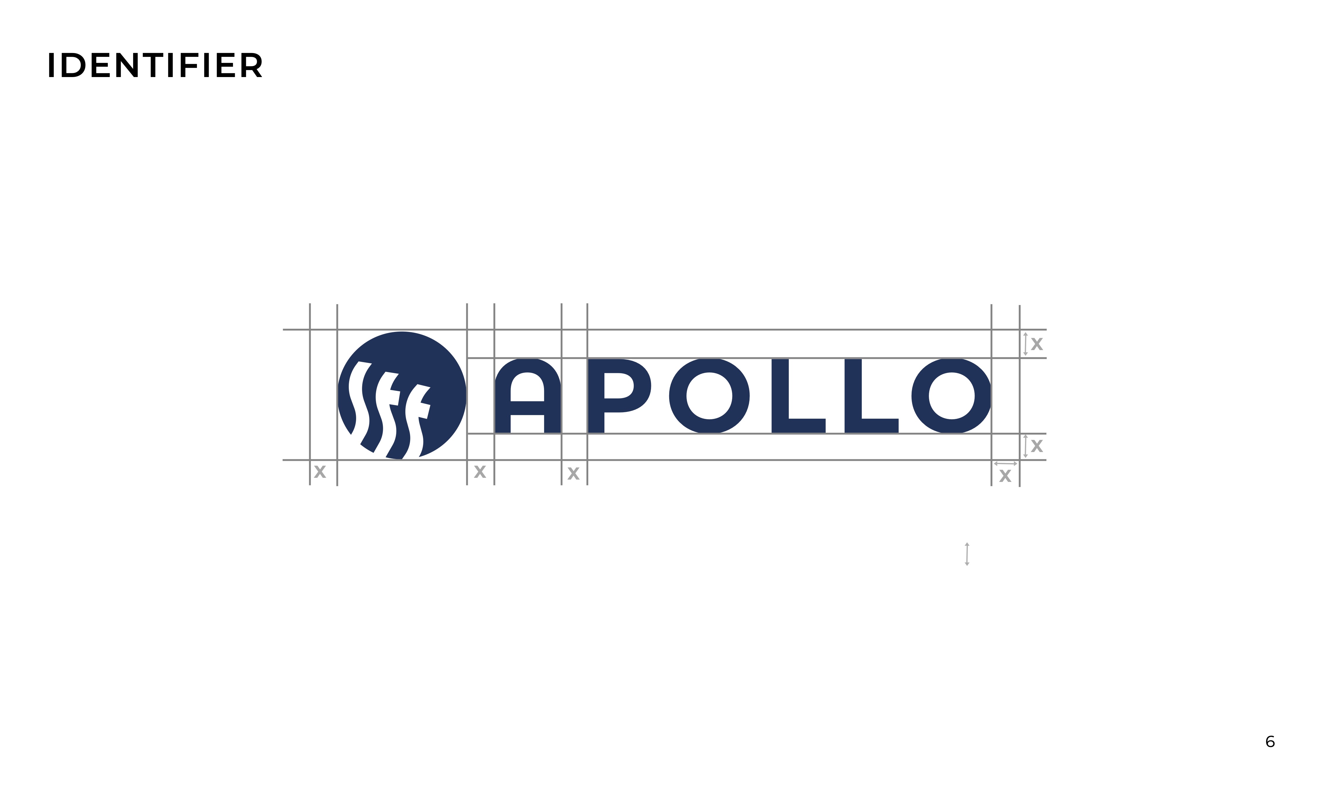
The combination mark pairs a custom logotype with a geometric symbol inspired by orbital paths and the arc of discovery. The system includes primary, stacked, and symbol-only variants, each tested across signage and print contexts.
Program Logos
Program logos extend the identity into Apollo's individual departments and programming areas. Each maintains a visual connection to the core mark while developing its own distinct character.
Wayfinding System
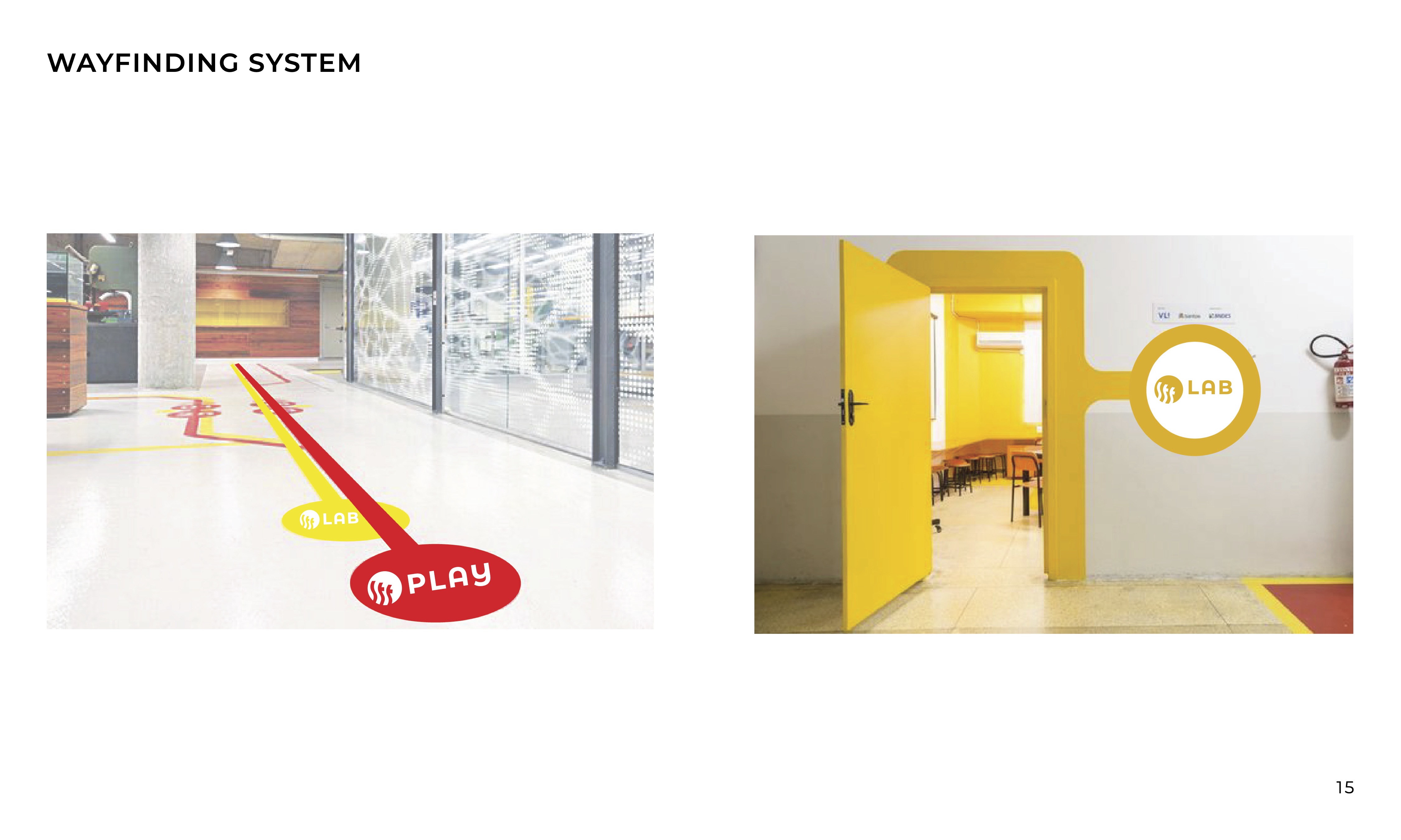
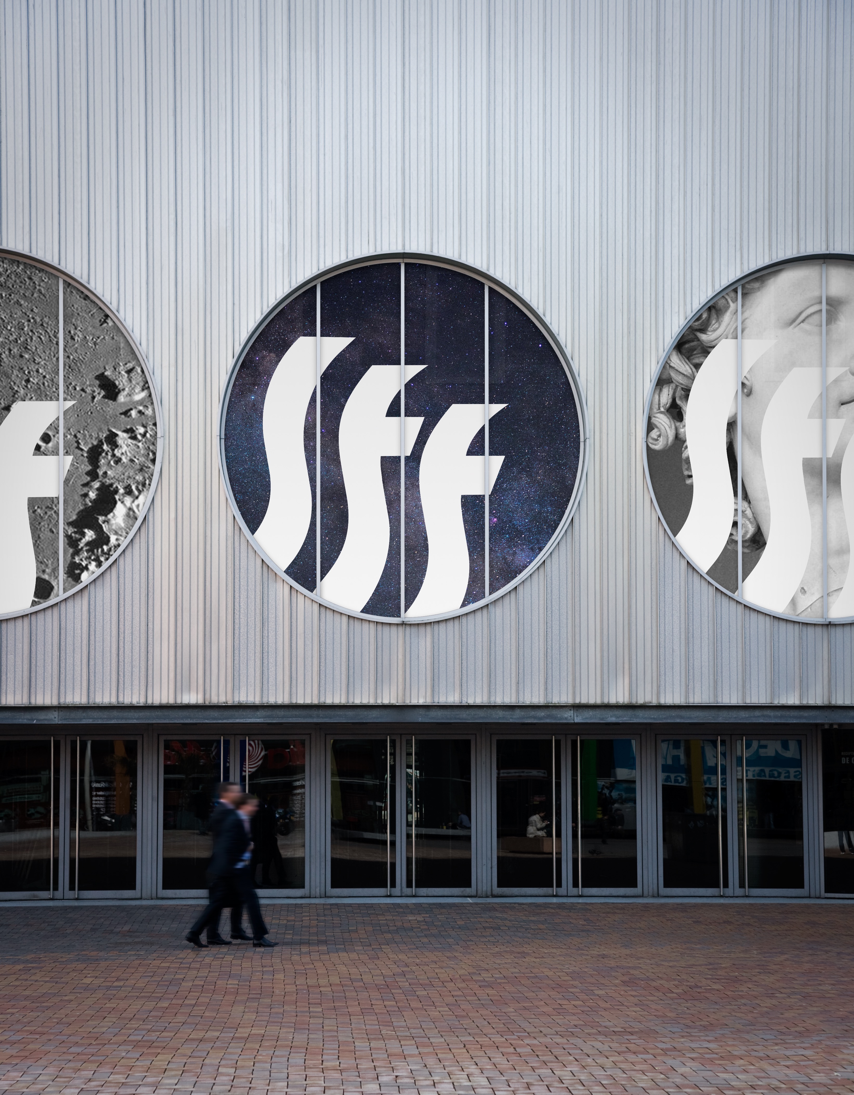
A speculative wayfinding system shows how the brand lives in the library environment. Color-coded zones, icon-based navigation, and consistent typography carry the identity across signage at every scale.
Campaign Posters
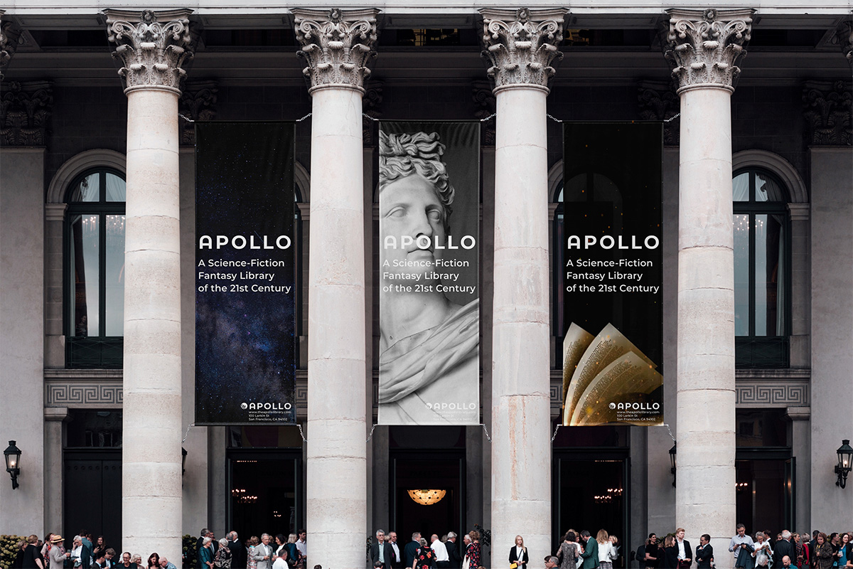
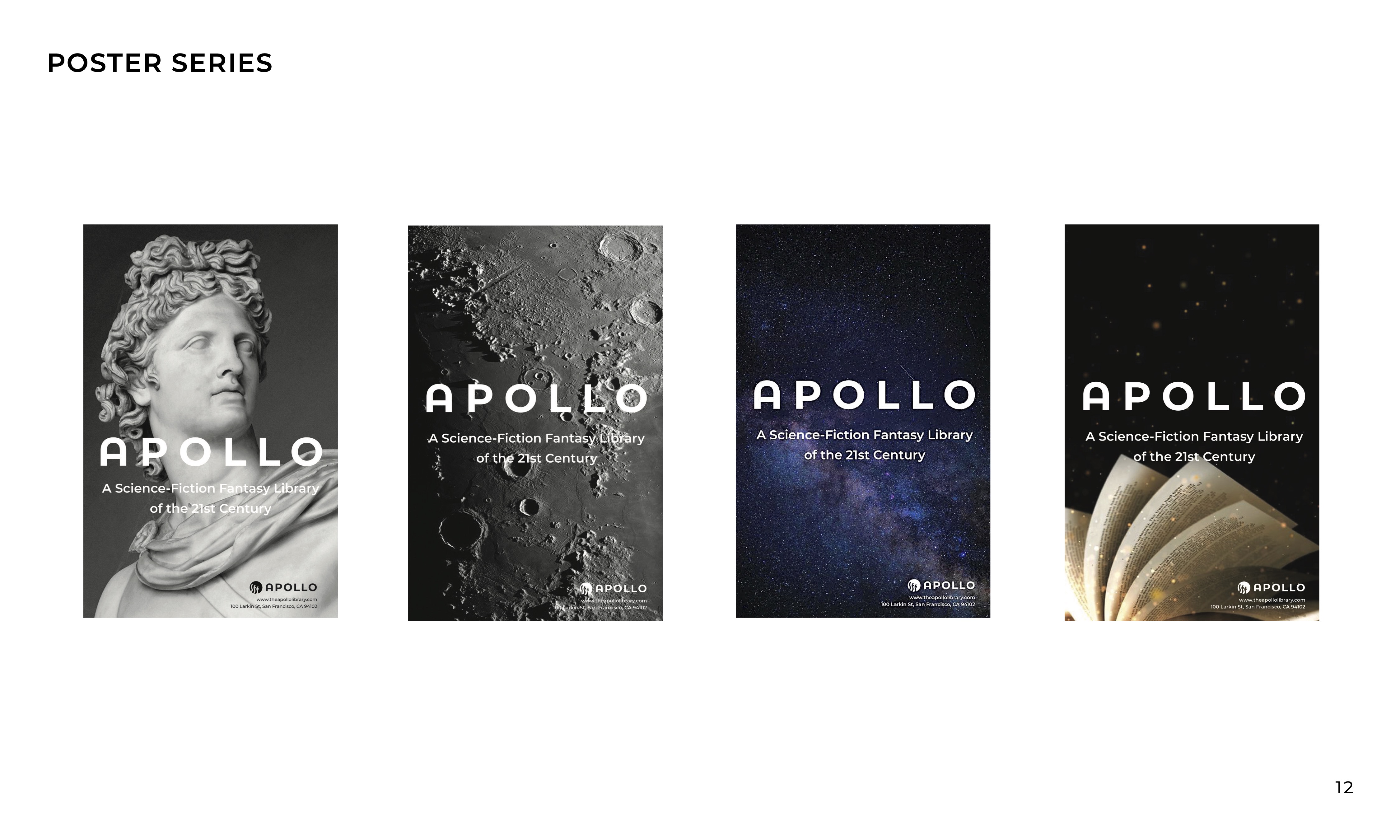
Four campaign posters show the brand out in the world. Each image traces back to the mind map. The god Apollo speaks to Fantasy, the moon and night sky to Science and Space, and an open book to the Library. Each poster is a different answer to the same question: what does Apollo mean?
Campaign — In Context
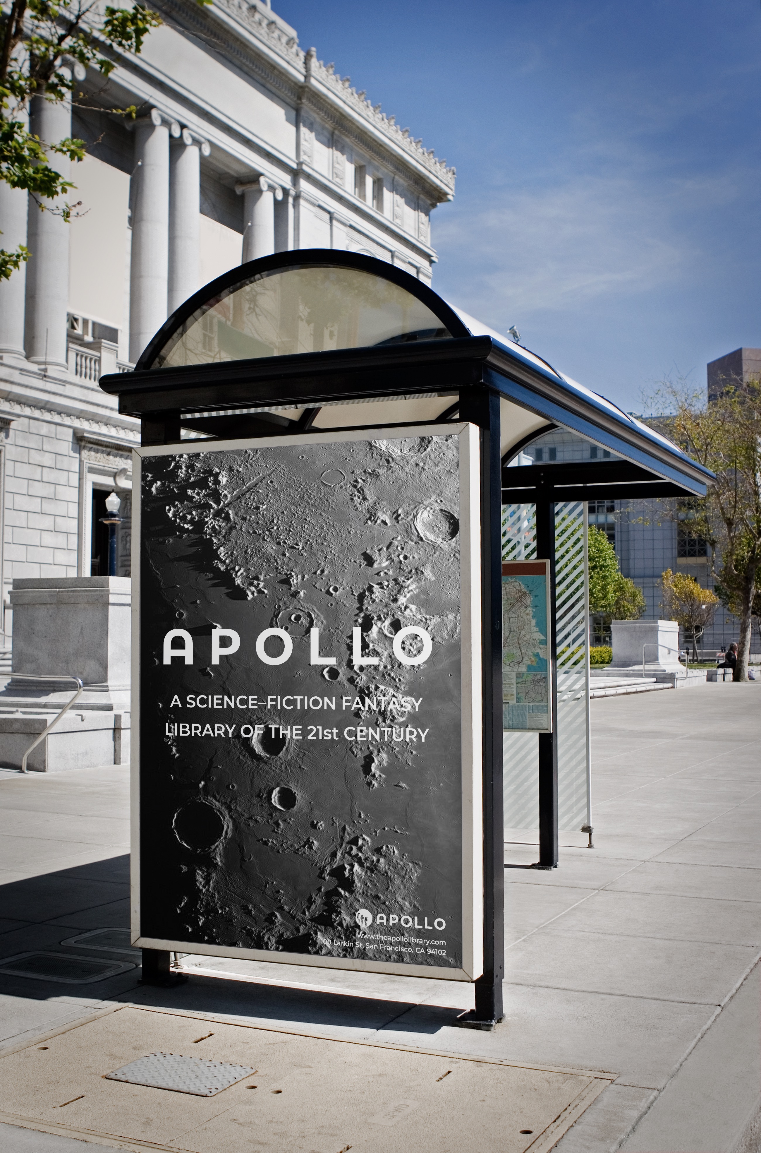
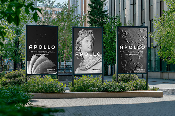
Apollo's campaign posters applied across real-world environments — city streets, transit banners, and public poster frames.
Final Outcome & Reflection
Apollo operates across every level of a brand system: identity, iconography, print, and environmental design. Working across all those deliverables at once required systemic thinking. Every decision in one area had consequences in another. The system only worked if it held together as a whole.
This project reinforced that brand identity is not just a logo. It is a system of decisions that must hold across every surface it touches, from a poster to a building. Designing the wayfinding system pushed me to think beyond the page and consider how a brand inhabits physical space and how visitors actually move through and read an environment. Apollo demanded a visual language flexible enough to hold knowledge, science, and fantasy at once. Building that system taught me what it actually means to design one.